A coffee with Edoardo
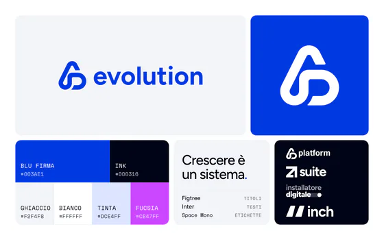
It's November 2025, I'm at the bar having a coffee with Edoardo and he tells me what they have in mind: he and his team want to grow, to go from offering "digital solutions for installers" to selling a growth system. He tells me that over the previous two years they had managed to get huge results for their clients and they know their target well enough to know what works. But their old site and their image couldn't keep up with how they had evolved.
The proposal
So I think about it for a few days and I propose a drastic rebrand, something that could really get through to their clients and reposition them as a "system", no longer as suppliers of small services.
The new mark
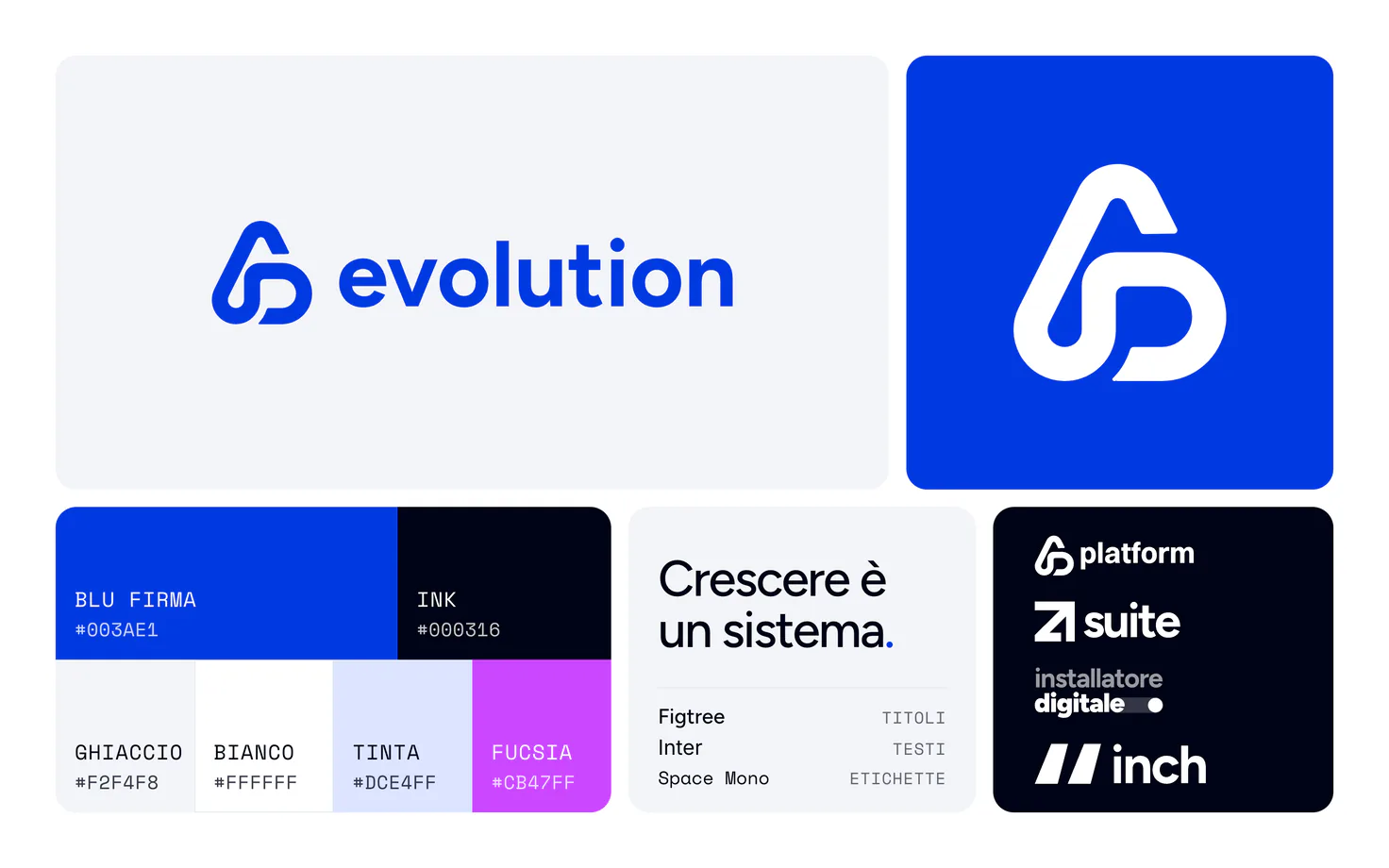
I get to work over the following months: I interview them one by one, I try to understand exactly how they want to be perceived, I mediate the conflicts that come up and I develop a first version of the pictogram to sit next to the logo.
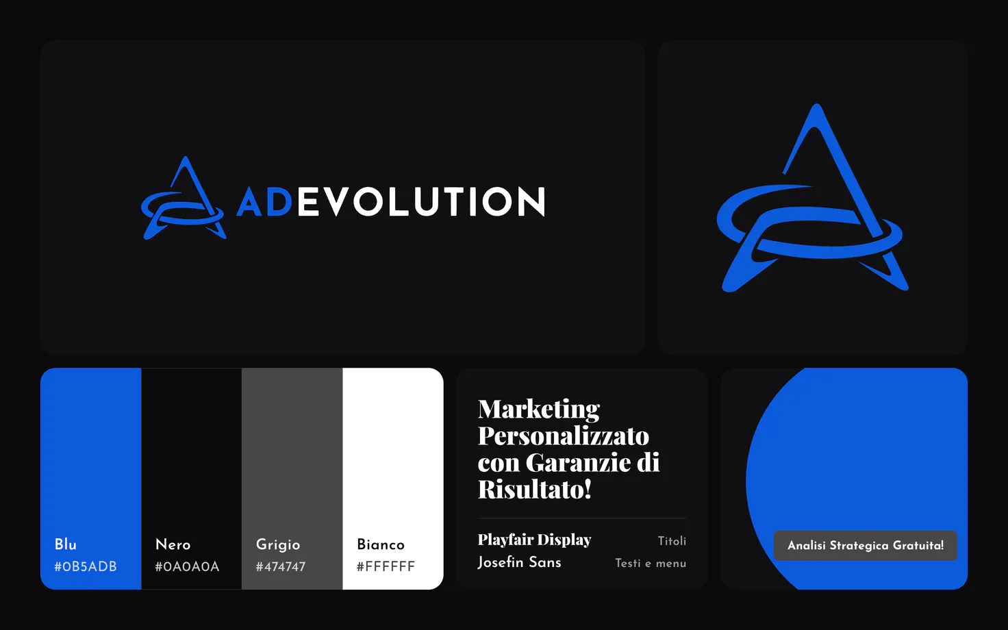
ADevolution is already a strong name for a brand: the problem was separating it from the image of a "generic marketing agency".
I analyse the feedback and the pictogram is liked, so I go on to develop the logotype, I research narrative, colours, shapes and symbols, and that's where the new visual identity is born.
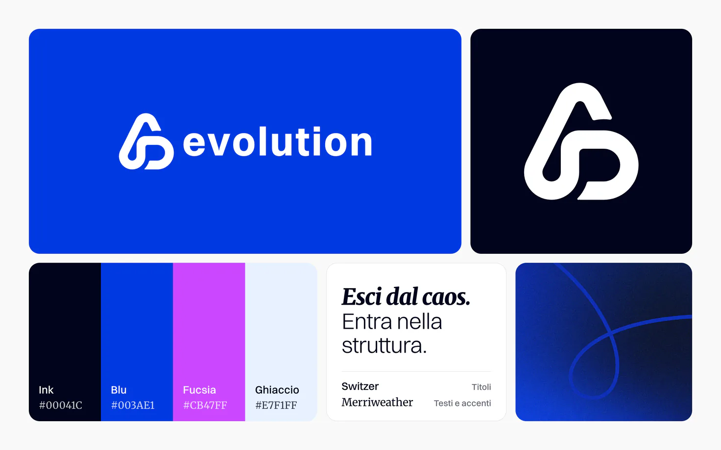
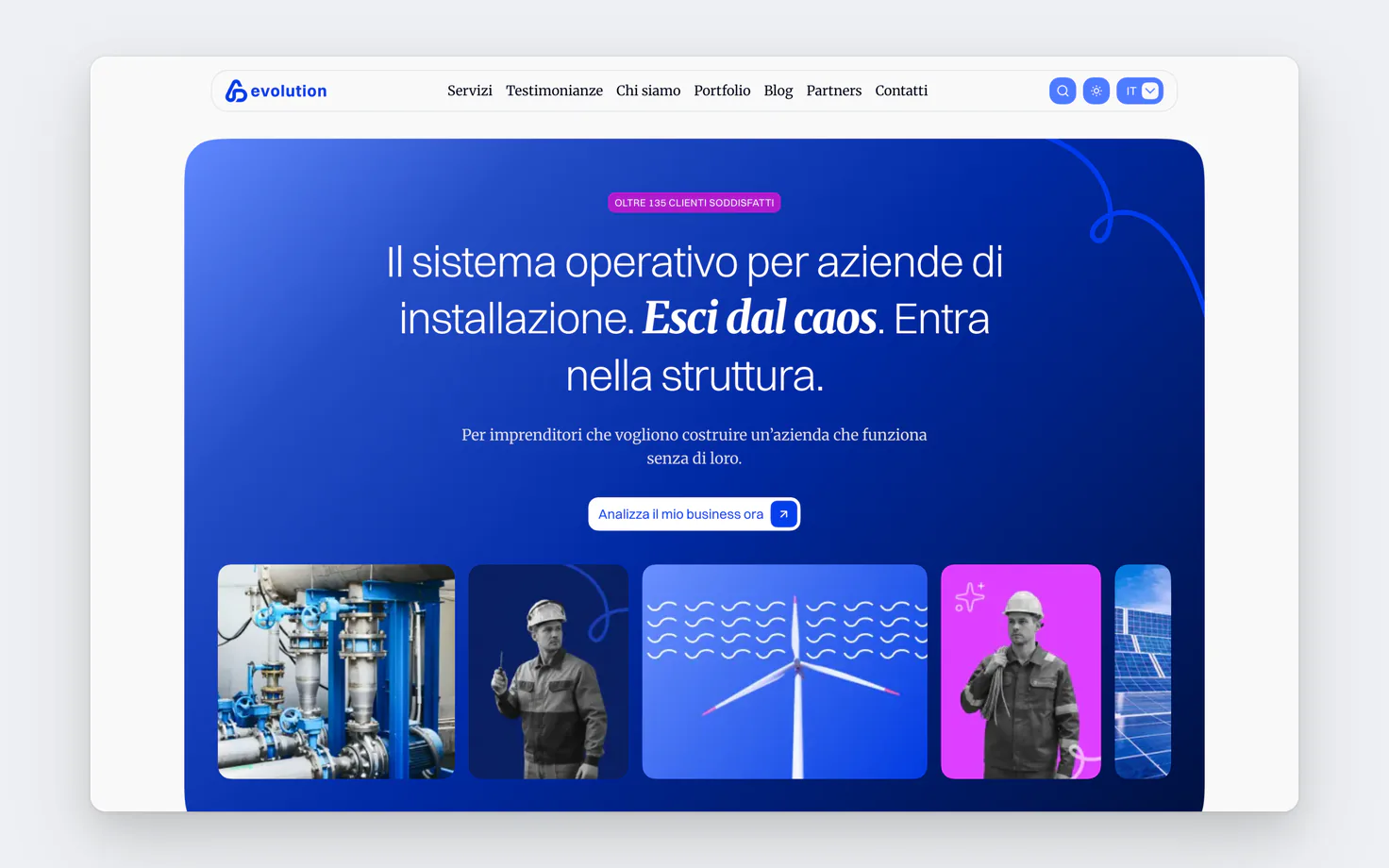
The guys fall in love with the new identity, so much that even before the project was finished they decide to print business cards and company t-shirts.
The bulk of the work
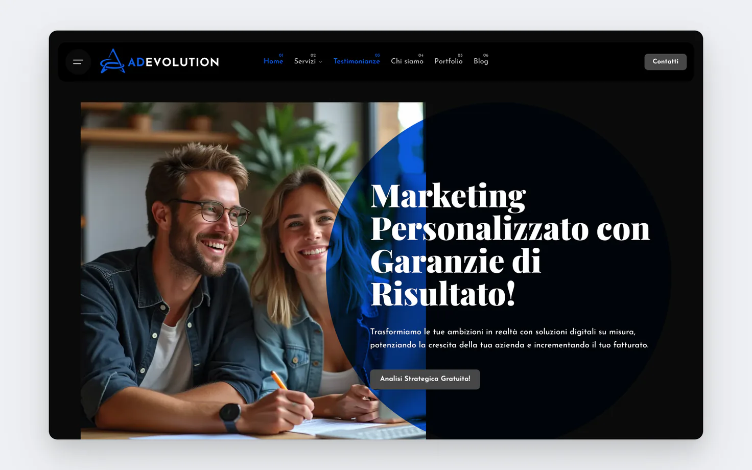
The bulk of the work came now: redesigning all their media. From the site to posters, social posts, print material, value propositions and so on.
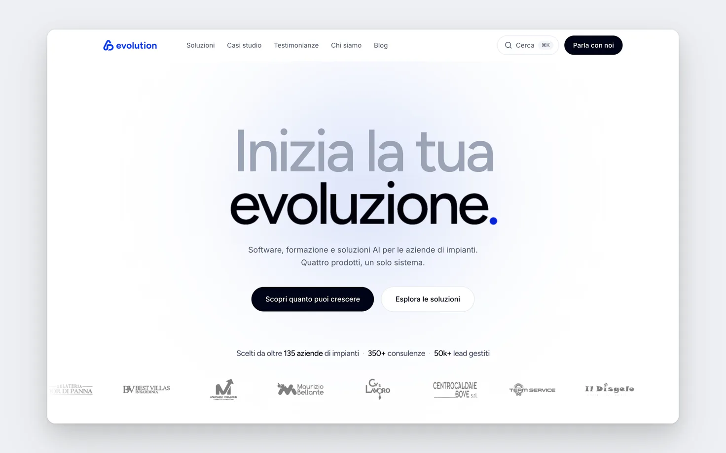
By mid-January, in about 2 months, they had the finished brand identity, the new site and the new value proposition.
The results
In the months after the v2 rebrand, ADevolution reached great new results: thanks to the new value proposition the contract closing rate rose to 70%, subscriptions to their growth system for installers passed 30,000 euros a year in recurring revenue, and inbound requests for stand-alone services dropped drastically.
When the rules weigh
Over the following months I analysed and closely watched how it was being used, and I realised the system held up, it was strong, but at the same time the team found it hard to follow the brandbook fully, and after 4-5 months it started to lose a bit of shape, while staying solid and having reached the goal of attracting clients interested in the system rather than in single services.
Version 3
So I start studying, and I realise the rebrand had worked, but its rules needed simplifying so the whole team could follow it fully. That's how the new version, V3, is born, with a new site and a new brandbook. This time cleaner, more professional and easier to scale as a system across their sub-brands too.