The cobbler's children
For two years I made brands and products for others, and ours was always left behind. The site talked like an engineer, the colours changed from one deck to the next, and the calculators I had put online brought loads of traffic, just from the wrong people.
2024: the first version
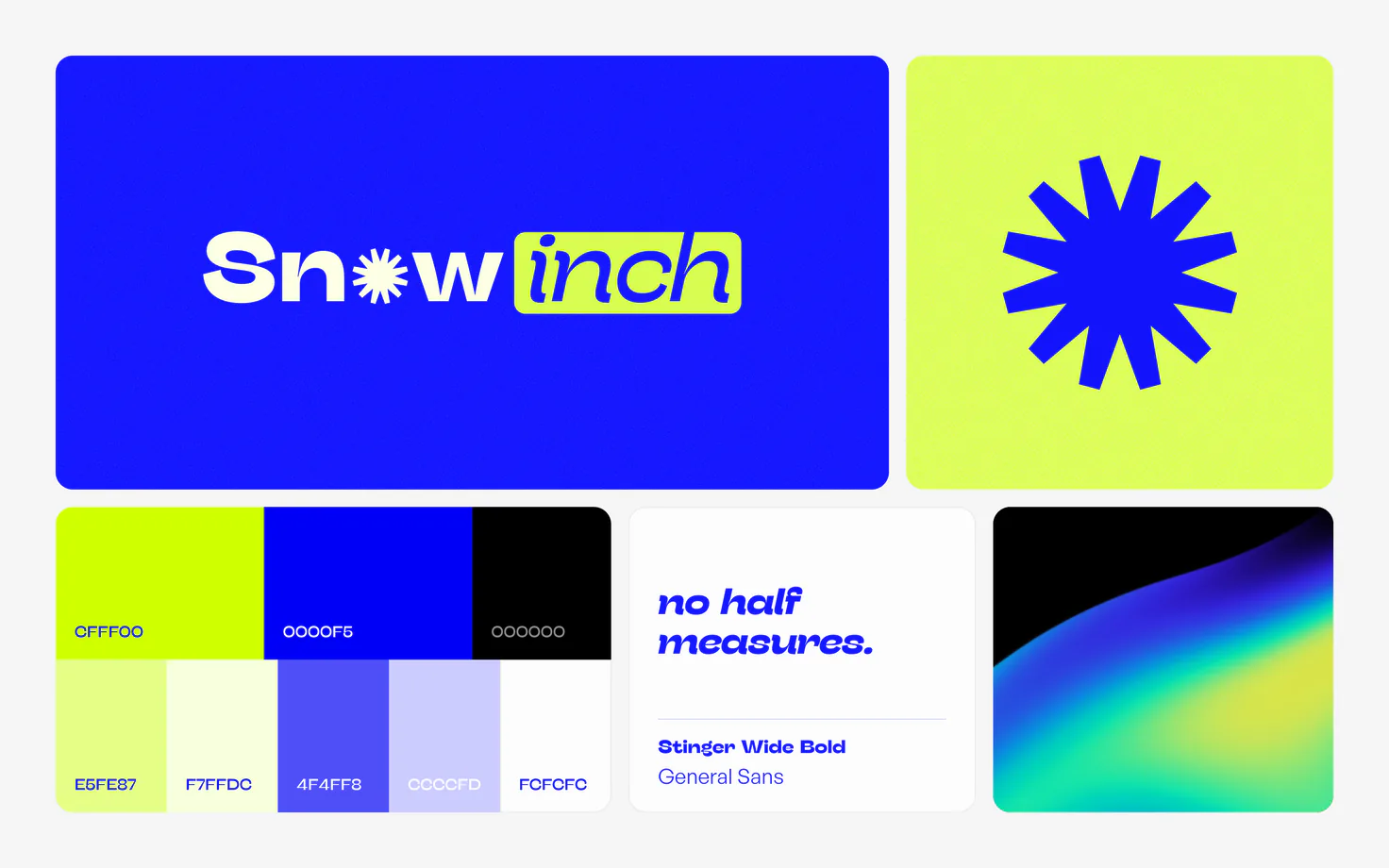
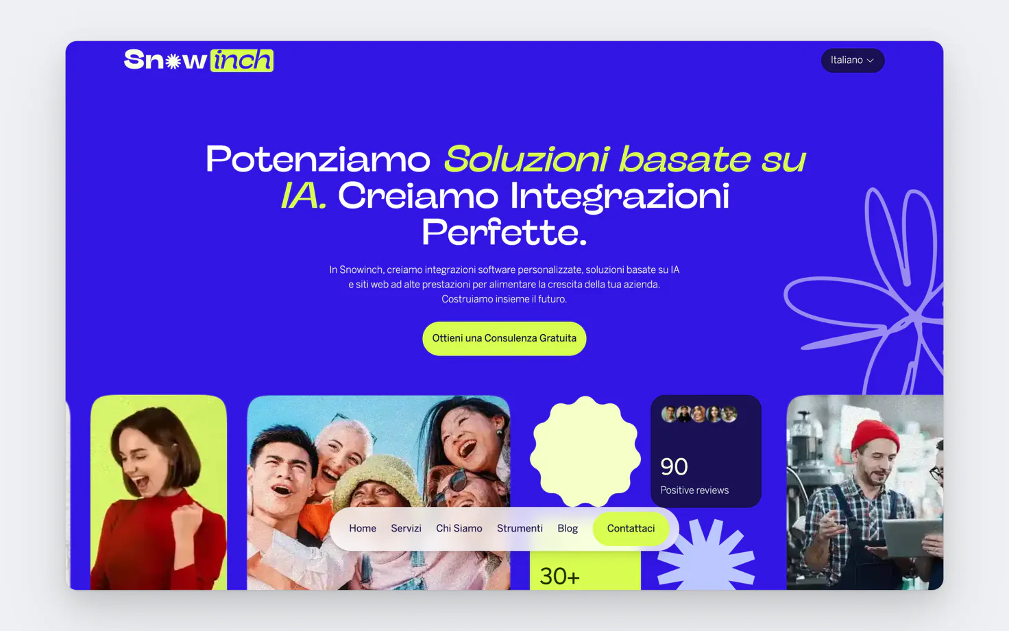
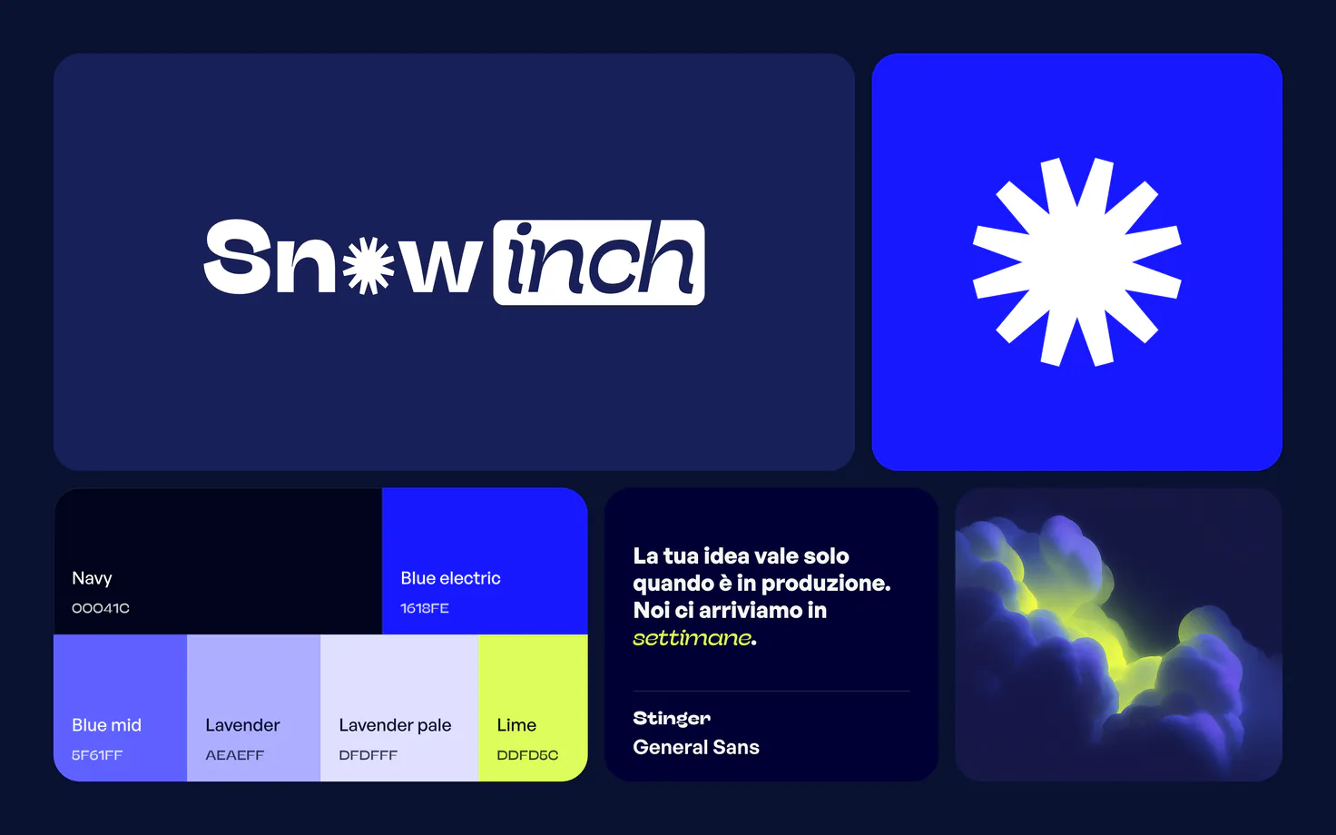
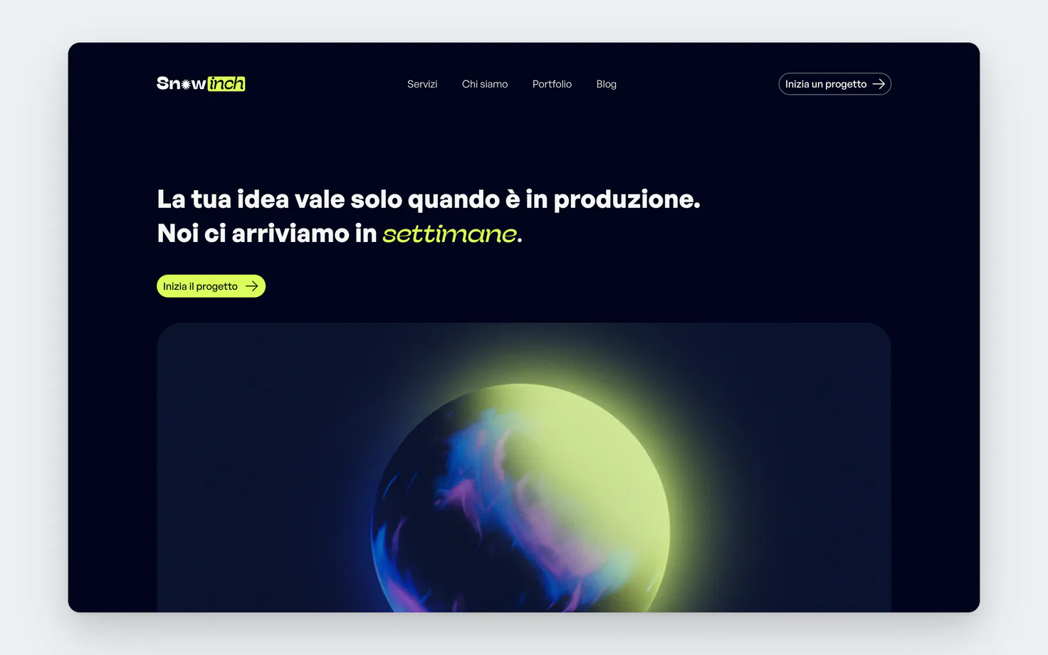
The first version was born in 2024. The logo and the first brand sheet were drawn by Giulio Pattaro, and the good idea was already there: the aurora, a light switching on in the dark. Giulio had set me up with solid work.
The problem was me. I never managed to stay consistent with it: one post in one colour, a deck in another, the site changing every time I changed my mind about what to sell. And bit by bit that work got lost.
Early 2025: version 2, simplifying too much
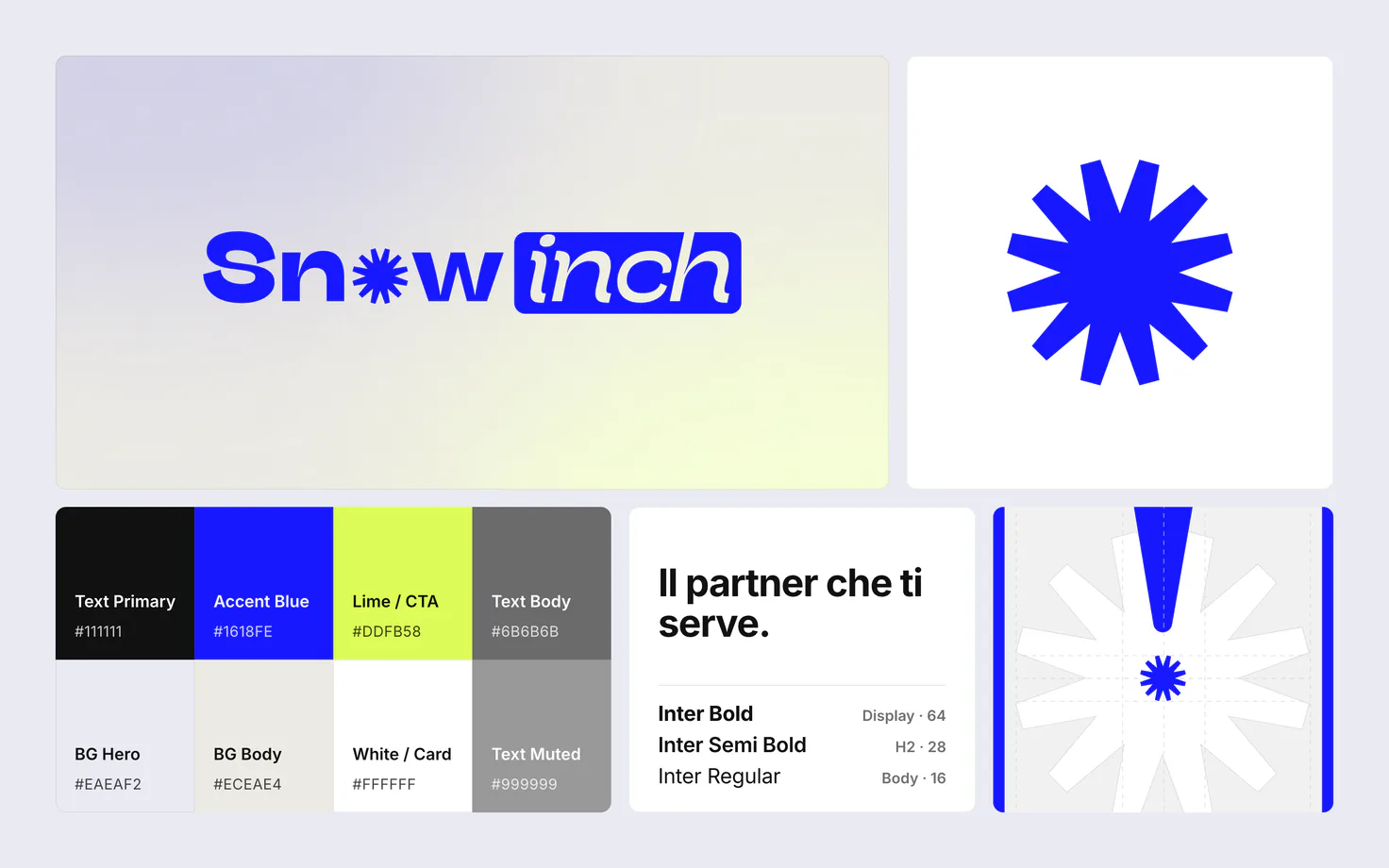
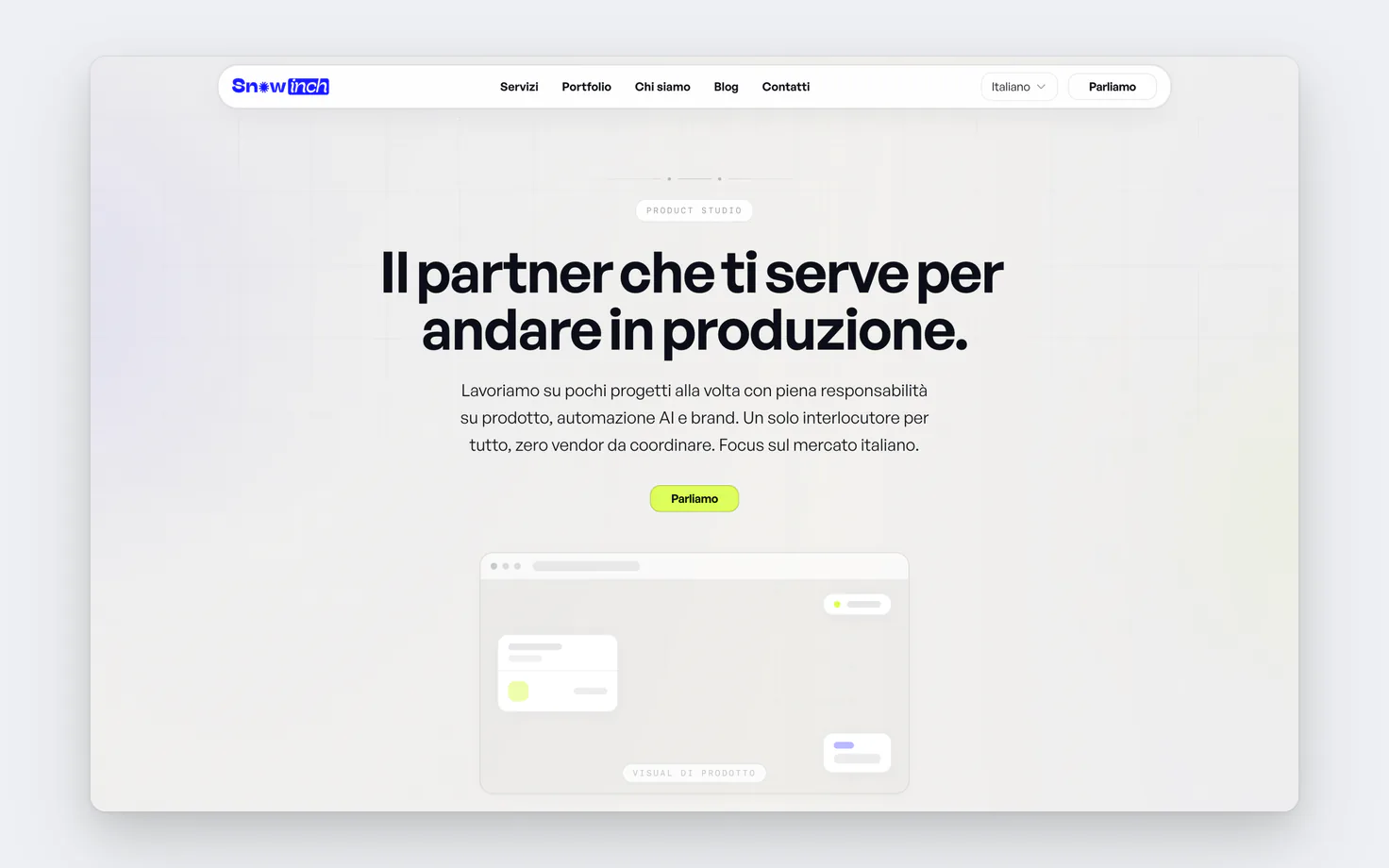
In early 2025 I decide to take the calculators off the site, to position it better. Traffic crashes, and that's fine: I'd rather have a few right founders than a thousand visits that never buy anything.
But I was in a hurry to fix the mistake, and to move fast I simplified everything, the brand included. Light colours only, no aurora, no voice. It was clean, but it wasn't Snowinch any more.
Six months later: version 3, too many colours
About six months later I decide to pick the brand's elements back up, starting with the aurora. But instead of starting again from there, I convince myself it needs a different concept, a more visionary message.
The mistake was experimenting too much with colour: along the way I completely lost the identity of the original brand. I had lost my direction.
Early 2026: version 4, back to the origin
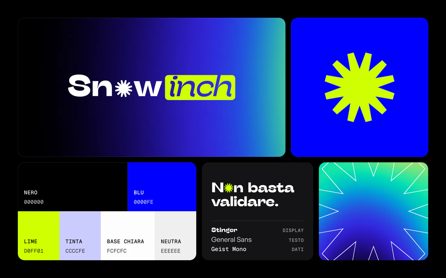
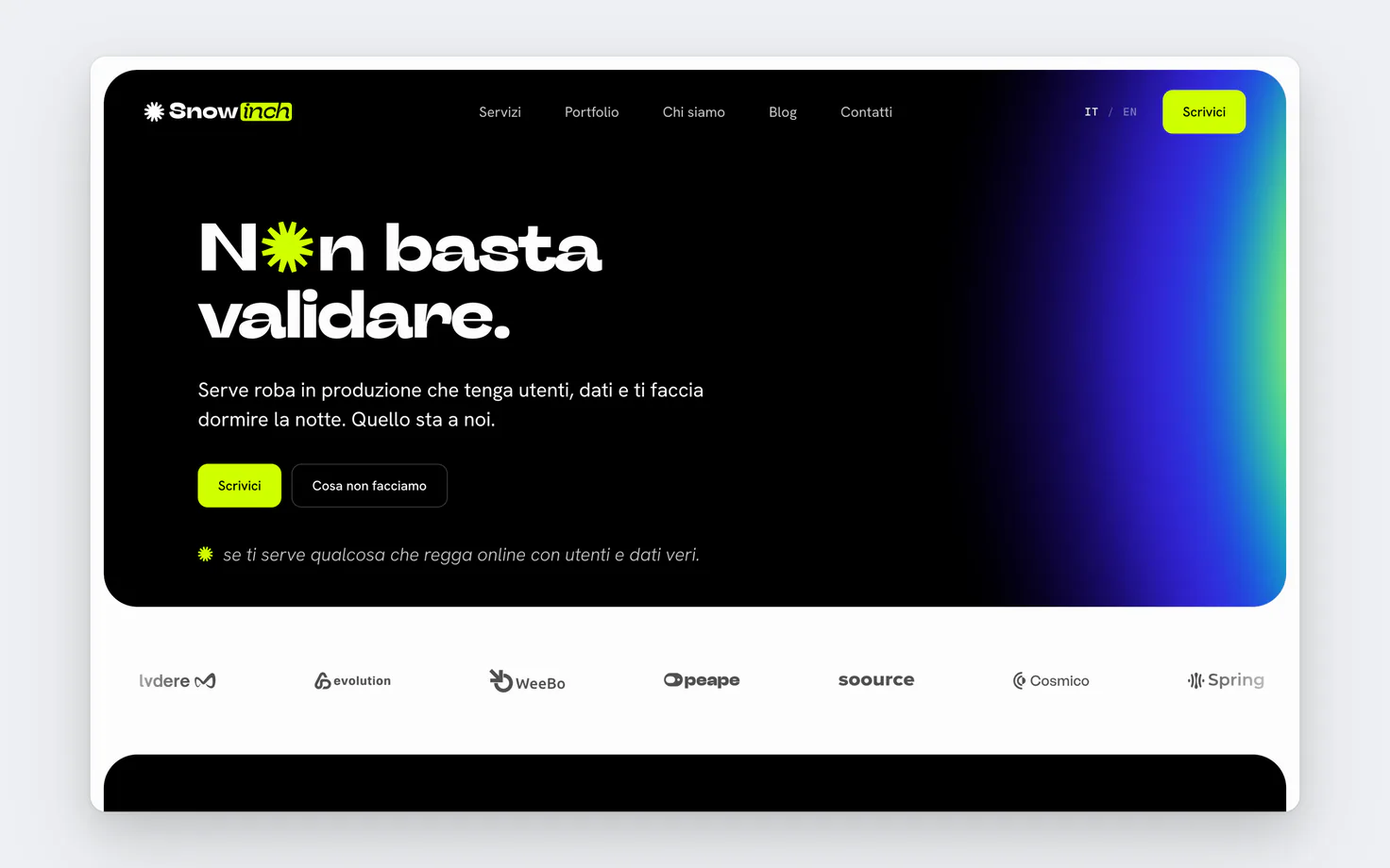
In early 2026 I try to put things right and bring back the brand's nature. With our designer we redo the brand: a twenty-one-board brand book, the twelve-ray symbol, the aurora as the colour of everything and the «Twelve» concept for the logo animations.
What wasn't working
It was tidy, but it talked like everyone else. Aurora was everywhere and no longer said anything, the copy explained how we build instead of why, and the symbol in place of the "o" in the logo looked more like a sticker than a signature. I said it to my own face: almost all of it had to go.
October: version 5
We started again from one sentence: closing the gap between what an idea is worth and how much the market notices it.
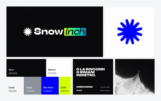
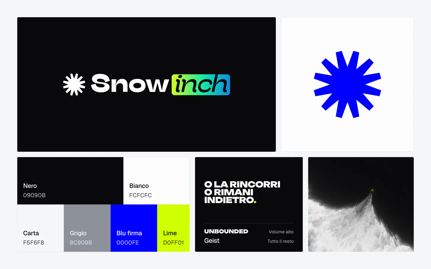
From there came a system with two volumes. Outside, the noise: black-and-white photos, blurred and grainy, huge titles in Unbounded, the avalanche. Inside, the precision: Geist everywhere, black and white, lots of air. In between a single bridge, the symbol and the lime, never used to fill space: every time it has to mean something.
We threw away the simplified logo, Stinger stayed only in the logotype, and aurora became light, once per page, plus the signature on "inch". We rewrote the tone of voice from scratch, from technical to vision.
From a dot to an avalanche
The visual direction has a name: from a dot to an avalanche. It all starts with an inch of snow, a single grain, and grows into an avalanche. It's the same thing we want for the ideas of the founders we work with.
The site, from scratch
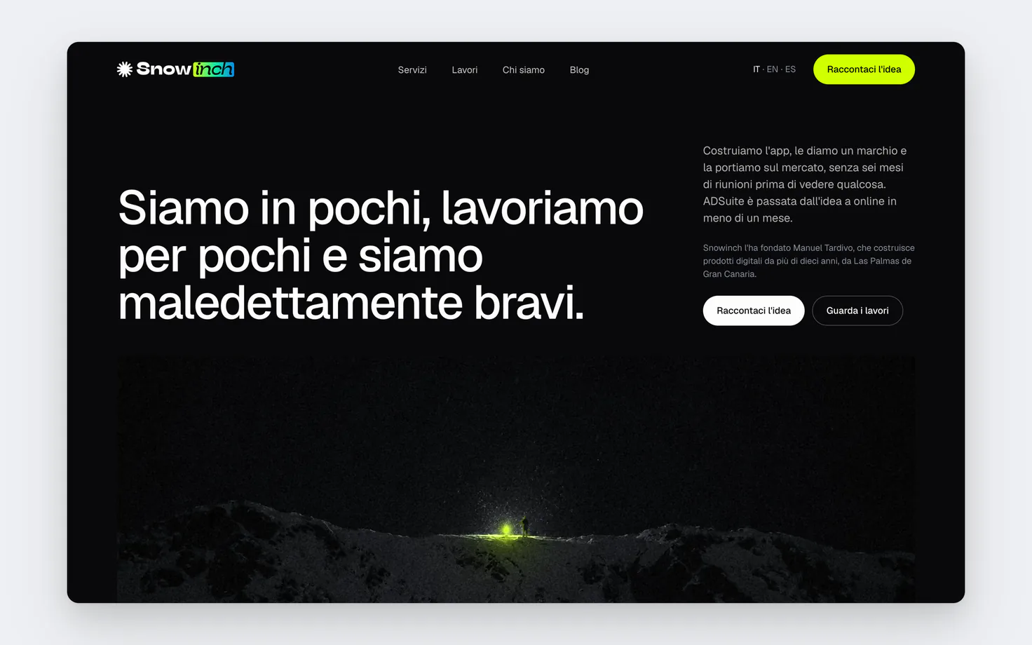
We rebuilt the site page by page: case studies told by the people who lived them, Italian, English and now Spanish too, for Gran Canaria and Spain.
What I learned the hard way
As a founder you lose your direction, and not because you're distracted: it's the pressure to sell that pulls you one way and then the other. Every time you change the brand to chase one more client you bend it a little, and along with the brand, the way your clients see you goes down the drain too.
That's why you need someone who keeps the vision clear and keeps the brand inside its lines, even when you'd like to step out of them. I learned it the hard way, and it's exactly what we do for the founders we work with.
Where we are
This is version 5, the one you're looking at right now: the one where the brand found its voice again. It won't be the last, but for the first time the Snowinch brand says about us what we tell our clients: a good idea nobody sees is worth nothing.