An inch of snow, handle with care.
Snowinch is a small studio by choice that stands next to founders with an idea and the budget to make it exist, until the market notices.
You design a brand beautifully and then, passing from hand to hand, it turns ugly: it always happens. Here you'll find the logo, symbol, colours, typefaces, photos and voice, with the rules so it doesn't happen to us.
On this page
The logo
The symbol comes before the word, and “inch” sits inside its label. It's a drawing, not a line of type: use the file as it is, never retype it in a font.
 Download SVG
On dark, with the aurora
The one in the nav: “inch” catches the aurora light. On solid black, never on top of photos.
 Download SVG
On dark
White, with “inch” in lime. The everyday version on black.
 Download SVG
On light
All signature blue, for paper, documents and light backgrounds. No lime on light.
Clear space
Around the logo, always leave at least half its height free: no text, edges or other logos inside that space.
22 px 16 px
16 pxMinimum size
On screen the full logo never goes below 22 px tall, the size it has in the nav on a phone. When space is tighter, use the symbol on its own, never below 16 px.
The symbol
An asterisk with twelve rays, like the hours on a clock face. It's the only piece every version of the logo shares, and on its own it has to be enough to say Snowinch.
Like this
Small and still as a signature, next to the logo or at the end, never below 16 px.
Big and cut by the edge when we raise our voice: campaigns, posters, the first screen of this page.
On clean surfaces: solid black, paper, lime or blue.
Not like this
On top of grainy photos: that's where hand marks and viewfinders do the work.
To fill a gap: if you can't say what it's doing there, take it out.
In place of a letter, not even in a headline.

Lime on black
The signature that stands out.
White on black
When the lime is already there.

Black on paper
For documents.

Signature blue on paper
The Snowinch pen.
Colour
Almost everything is black, white and cool greys. Photos and 3D bring the light, and lime comes last, a little and always for a reason: the button that matters, the dot, the light in a photo.
- 80%black, white and cool greys
- 15%photos and 3D
- 5%lime
Tap a swatch and the code is copied. No cream, beige or warm greys, in any material.
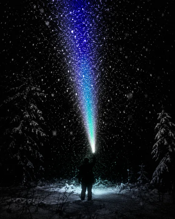
The aurora is light
Five colours that only live inside images, like the beam of a torch or headlights in the snow. Once per page or per video, never as a still background.
- 01008E
- 2410F2
- 0A8CE0
- 14E6A6
- D2FF1F
Typography
We use two typefaces: Unbounded when we raise our voice, Geist for everything else, site headlines included.
Unbounded Black
Capitals only, and only at full volume: campaigns, posters, videos, one headline per page. Never in text meant for reading.
Geist
Regular for reading, Medium for headlines, SemiBold now and then. We don't use monospaced capital labels.
Photography
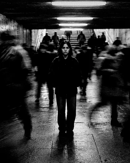
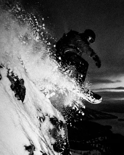
People and things in motion, in black and white, blurred and grainy, never posed and never fake silhouettes. Colour comes in as a single event: a light, a trail, a jump toned in blue and lime.
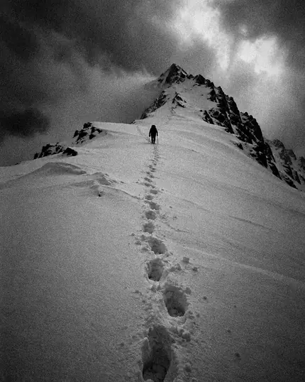
Tiny against huge.
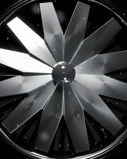
The symbol, found in the world.
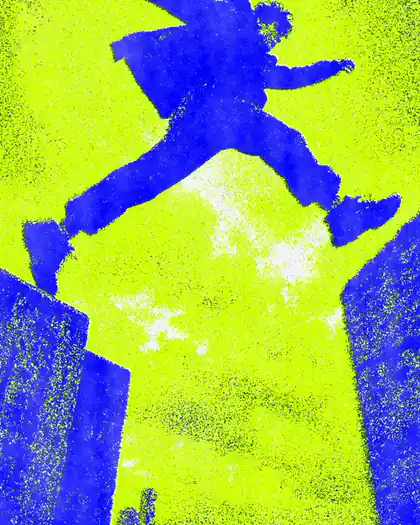
Toned in blue and lime.
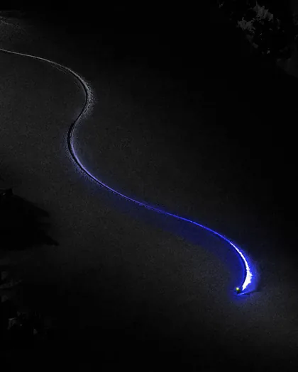
One trail, one colour.
Viewfinders and hand marks
The symbol doesn't go on photos. Viewfinders do, locking onto who matters, and so do hand marks, like an art director correcting a print: white, with lime only when the viewfinder locks on.
The voice
We talk the way we'd talk to a founder friend at the bar: lines that sound said, not written, with a real fact inside. No exclamation marks, no agency words, no technical lectures.
- Not like this
We say no. For free.
Like thisIf your idea doesn't convince us, we tell you straight away, and it costs you nothing.
- Not like this
A few founders at a time. Always.
Like thisWe take few projects, because when we take one we dive in with our heads, our nights and everything else. With twenty clients you can't do that.
- Not like this
A good idea should get seen, not get introduced.
Like thisYou can have the best product in the world, but if nobody sees it, it might as well not exist. I know because I've been there.
- Not like this
Normal is already taken.
Like thisThe world is full of normal products. If yours wants to end up there, good luck.
The lines on the left were written by an artificial intelligence, the ones on the right were approved by Manuel on 16 October 2026.
Do and don't
The mistakes we see most often, redone with the real files: on the left how not to do it, on the right how to.
- NoYes
The symbol in place of the “o”. Manuel calls it kid stuff: the symbol comes before the word, never inside it.
- NoYes
The logo stretched or squashed. It only grows or shrinks all together.
- NoYes
“inch” in another colour. The label is lime, or the aurora of the nav.
- NoYes
The logo on a background it doesn't stand out from. On light, the signature blue version, on black, the white one.
- NoYes
The symbol on top of a grainy photo. On photos, the viewfinder does the work.
- NoYes
Lime sprinkled around to fill space. One lime thing per screen, and it needs a reason.
Get the files
The files are vectors and are used as they are. If you need something else, a photo, a print format or a couple of lines about us, write to us and we'll send it over.